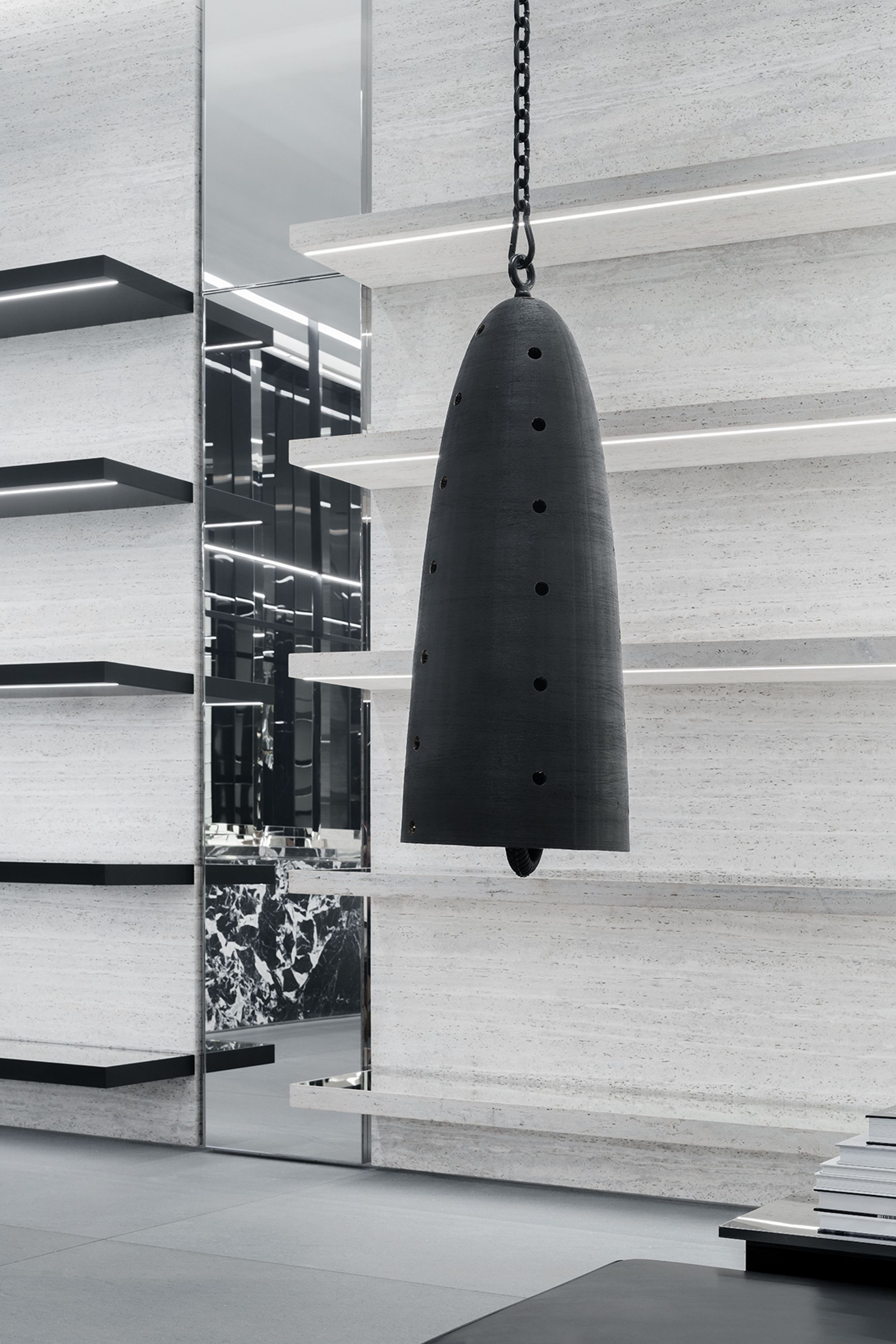
Catcher (2019), a caste bronze bell on a steel chain by Davina Semo, on display at the Celine store in the Miami Design District.
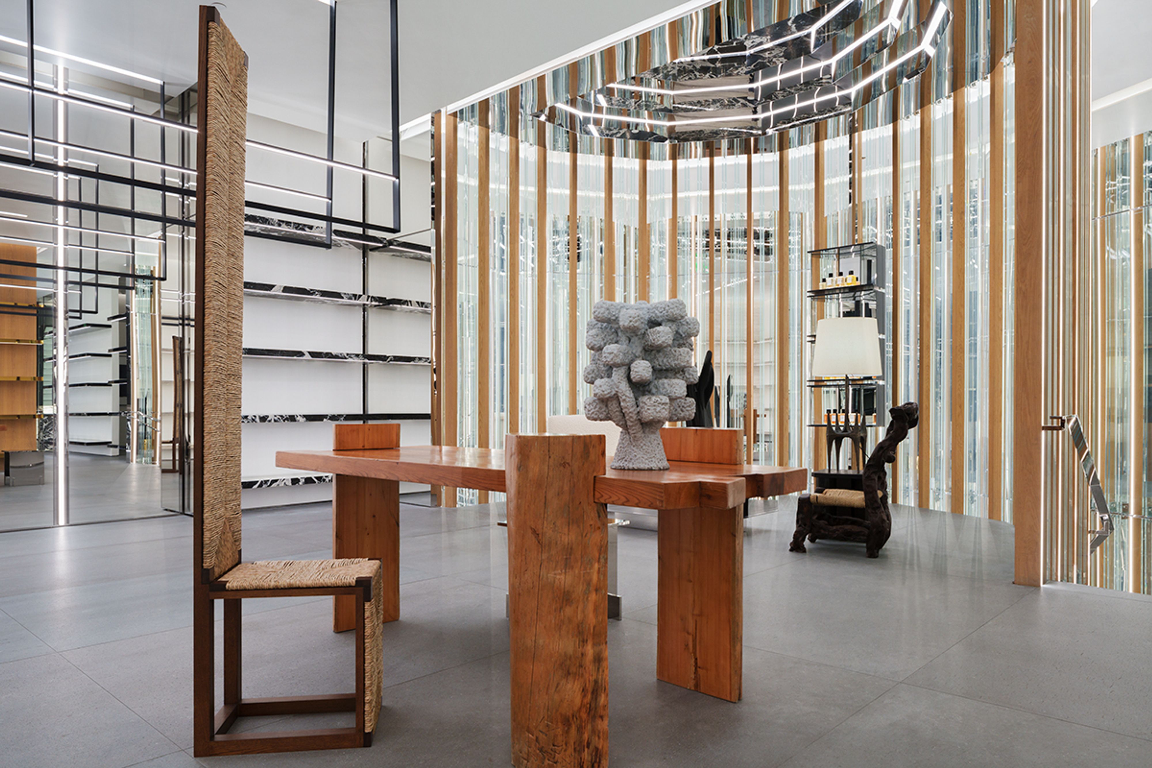
Turbine (2022), a ceramic sculpture by Antonia Kuo on display at the Celine store in the Miami Design District.
Alongside the black gauffered silk crop tops, prim bouclé tweed cardigans, and sporty lambskin tracksuits you’ll find on the racks in any Celine store around the world is a permanent collection of contemporary art that rivals that of any biennial or blue-chip gallery. Elaine Cameron-Weir, Simone Fattal, Theaster Gates, Oscar Tuazon, and Banks Violette are among the artists in the collection of 250 site-specific works that make up the Celine Art Project, curated by Hedi Slimane, the creative, artistic, and image director of the French luxury fashion house since 2018. The art is just one element of the gesamtkunstwerk that Slimane has created with the design of the brand’s stores; all the pieces he’s selected — mostly sculptures that nod toward Brutalism — fit nicely among the Roman lava-stone basaltina, Bianco Raffaello granite, reclaimed oak, concrete, brass, and gold that you’ll find in the floors, on the walls, and along the shelves.
Furniture, of course, is also a part of Slimane’s holistic vision — he designed much of the furnishings himself — and is one of the ways that each interior responds to the cultural and historical context of its specific location. In the Madison Avenue store, for example, a blond wood chair evocative of Donald Judd faces a monolithic sculpture by James Balmforth, and in the London flagship on New Bond Street, classical 17th-century oil paintings adorn the walls surrounded by the building’s original Edwardian arches, columns, and moldings.

Catcher (2019), a caste bronze bell on a steel chain by Davina Semo, on display at the Celine store in the Miami Design District.
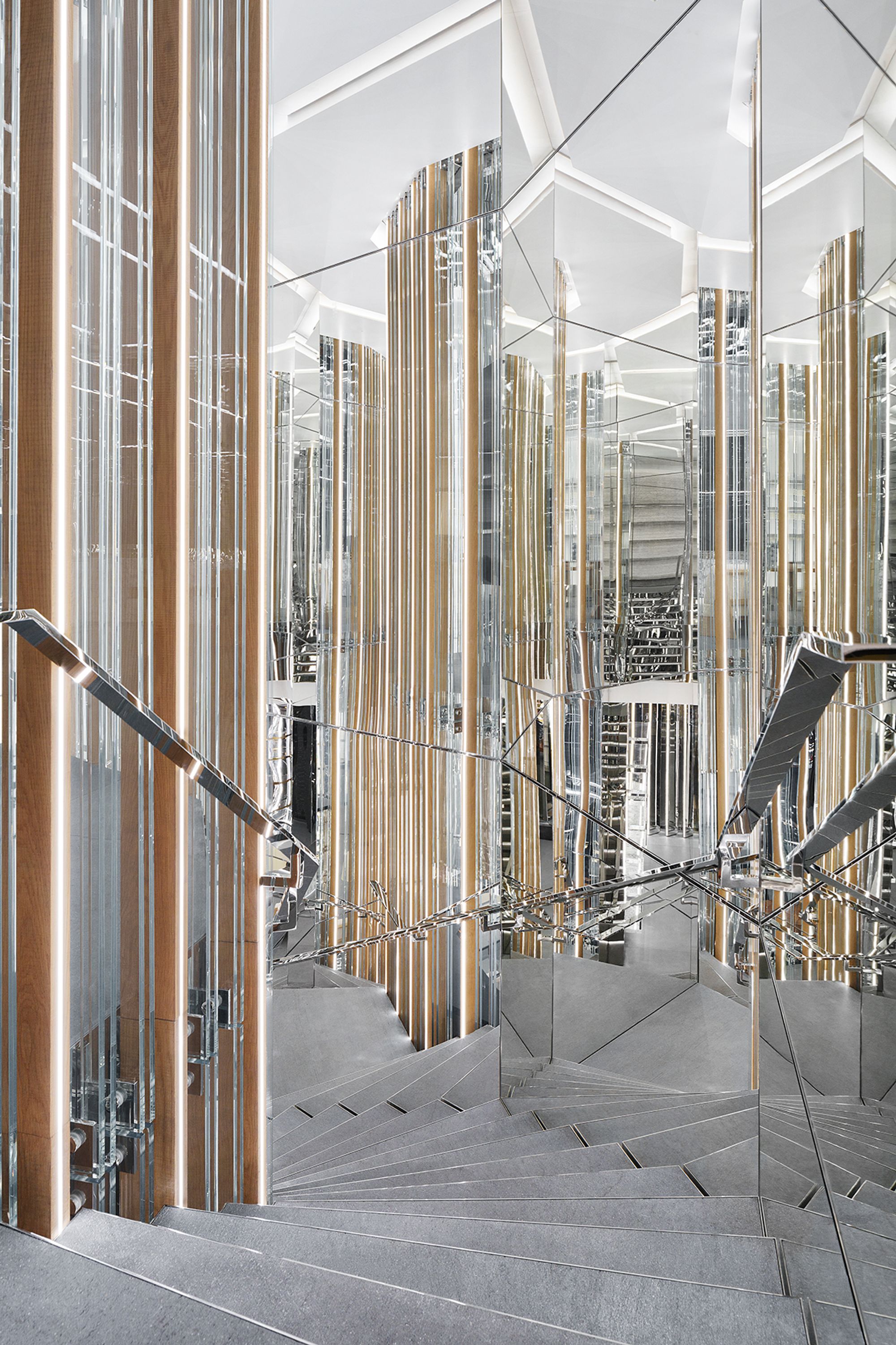
The interior of the Celine store in the Miami Design District.
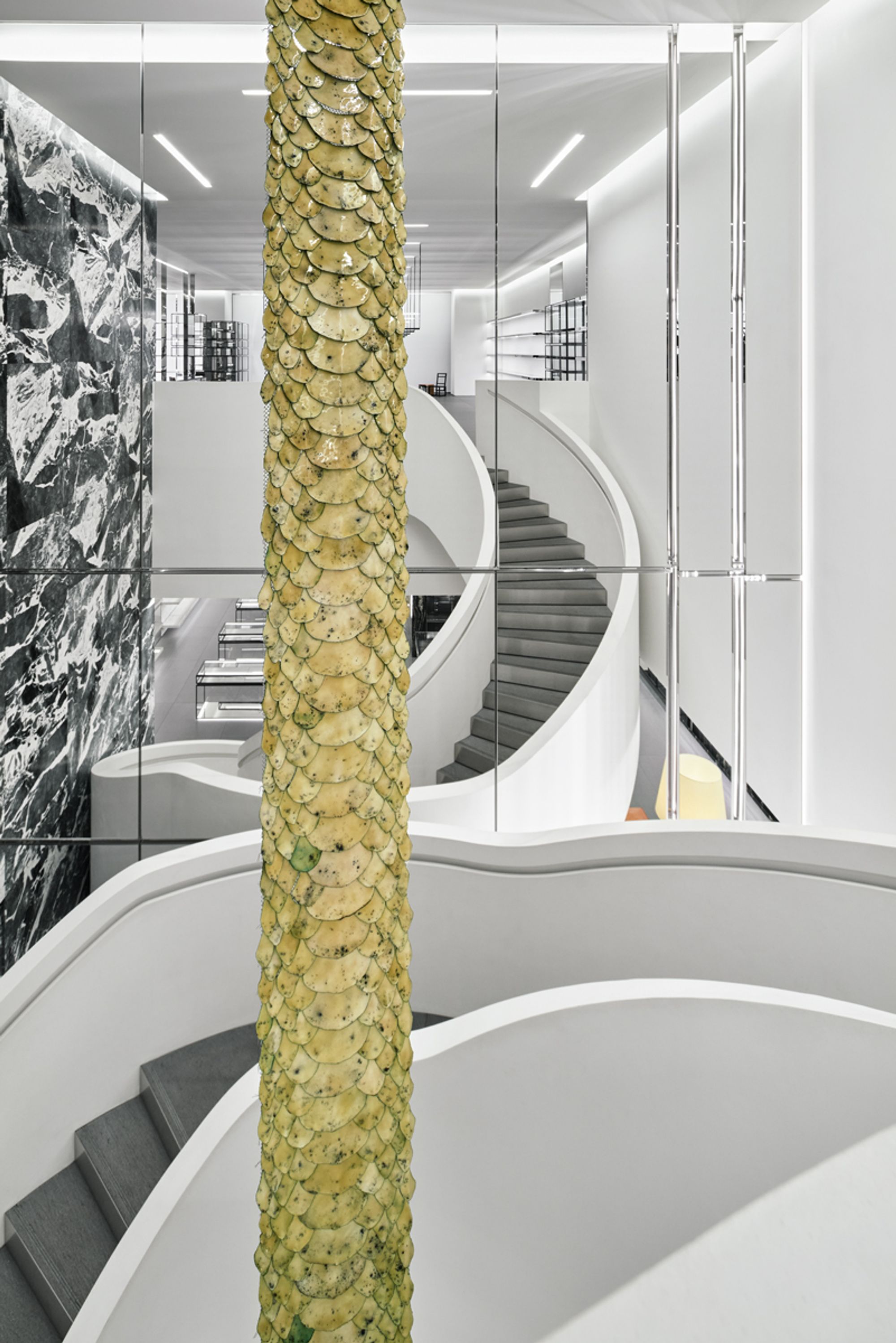
But the real triumph of the Celine Art Project is its incorporation of radical ideas and aesthetics that are seemingly opposed to the old Parisian sense of “quiet luxury” that Slimane has reinstituted during his tenure at the brand; Slimane’s first collection for Celine captured a specific 70s sartorial code, or “precisely what the original Celine was and had meant to every French bourgeois woman — before fashion ever got its hands on it,” as Vogue’s Sarah Mower wrote in a 2019 review, a year after Slimane took over. Take Antonia Kuo’s pieces — shown in the newly renovated Miami Design District flagship, the Okinawa DFS store, and the Nanjing IFC location — craggy sculptures that she molds in wax and dips in a ceramic slurry with silica sand before firing them, inspired by the industrial molds of her father’s side of the family’s foundry. She describes them as “embodied entities or totems” that exude, “an atemporal otherworldliness, from a distant past or obscure future”; their “strange, strong, and elegant” nature lends themselves to the aesthetics of the Celine stores. “I enjoy the juxtaposition of these industrial objects then being displayed in such a sleek, ‘elevated’ setting, which is a testament to how the space around a sculpture shapes the way it’s perceived,” Kuo says.
At first glance, artist Davina Semo’s works seem similarly at odds with their luxe settings Semo has described her cast-bronze bells as protective, although they’re also understood as catalysts of celebration, protest, and community. Semo’s bells were featured in Reverberation, which was on view at Brooklyn Bridge Park from August 2020 to April 2021 — park-goers could toll the bells as they pleased. But ringing a matte-black cast-bronze bell hung by a steel chain in a store filled with biker jackets and sequin sablé tuxedo jackets that cost thousands of dollars is an entirely different prospect. But “there is a profound harmony in having a collection of individuated artworks at home alongside individuated garments,” Semo says. “The whole project of being an artist is connected here across fashion and art.”
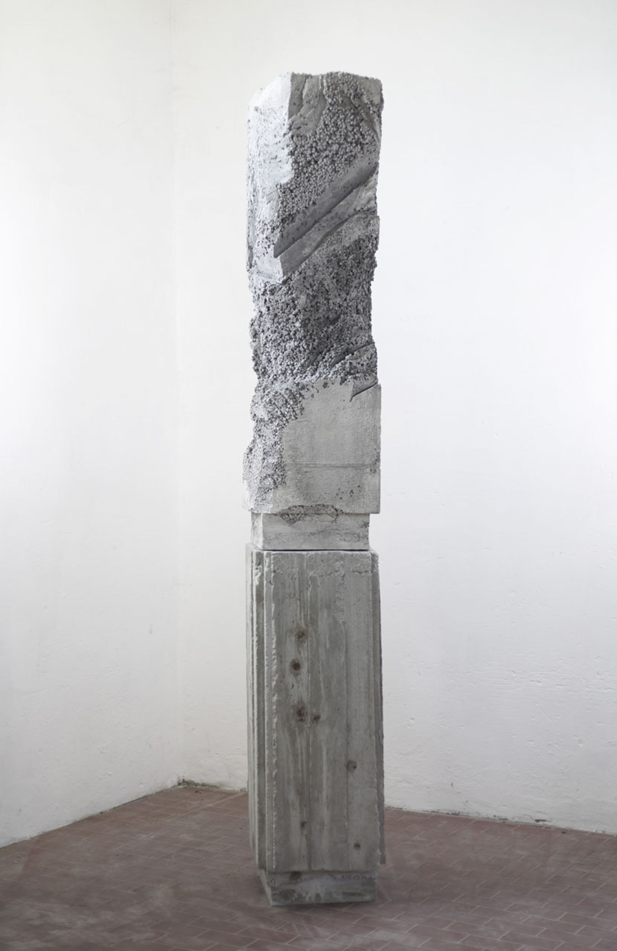
Luca Monterastelli, Reinforced Concrete (2018); concrete. Courtesy the artist and Galleria Lia Rumma in Milan and Naples.
Snake X (2019), metal chain adorned in copper and enamel by Elaine Cameron-Weir, on display at the Celine store on Omotesandō Avenue in Tokyo.
Artist Luca Monterastelli, whose austere reinforced-concrete sculpture towers high in the Soho store in New York, believes the retail context doesn’t affect the “grammar” of his work, which addresses the “propaganda function” of sculpture and architecture. He references Carlo Scarpa and Enzo Mari as forebearers of the Celine stores’ design logic; in the case of Scarpa’s 1957 design of the Olivetti store in Venice, “the worldliness of the shop can become an opportunity to create an environment in which the ideals of the company it represents become elements of tangible architecture,” and with Mari’s 1966 design of the Glifo shelving system for Gavina, commercial display was “elevated to a form of art.”
The fact that Monterastelli’s sculpture, made from concrete that’s been “subjected to such extreme physical stress that it becomes empathic,” is in a luxury store only enhances the conceptual thrust of the piece. “If you think about it, works of art always end up in contexts that are different from the needs that generated them,” Monterastelli says. “The works of our time almost all tell the story of an injustice that has happened or is happening, and are usually exhibited in contexts that were at least complicit in those injustices.” Consider the relationship between the exclusivity of high-end art fairs and the sometimes radical works exhibited in them, Monterastelli continues. “I think that contemporary artworks live in this gap, and I think that at the moment, it is also the only possible habitat that welcomes them.” Slimane’s design for the Celine stores not only collapses these gaps between architecture, art, and fashion, but it upends the fashion industry’s obsession with newness — a welcome dose of material permanence amid the ever-changing racks.
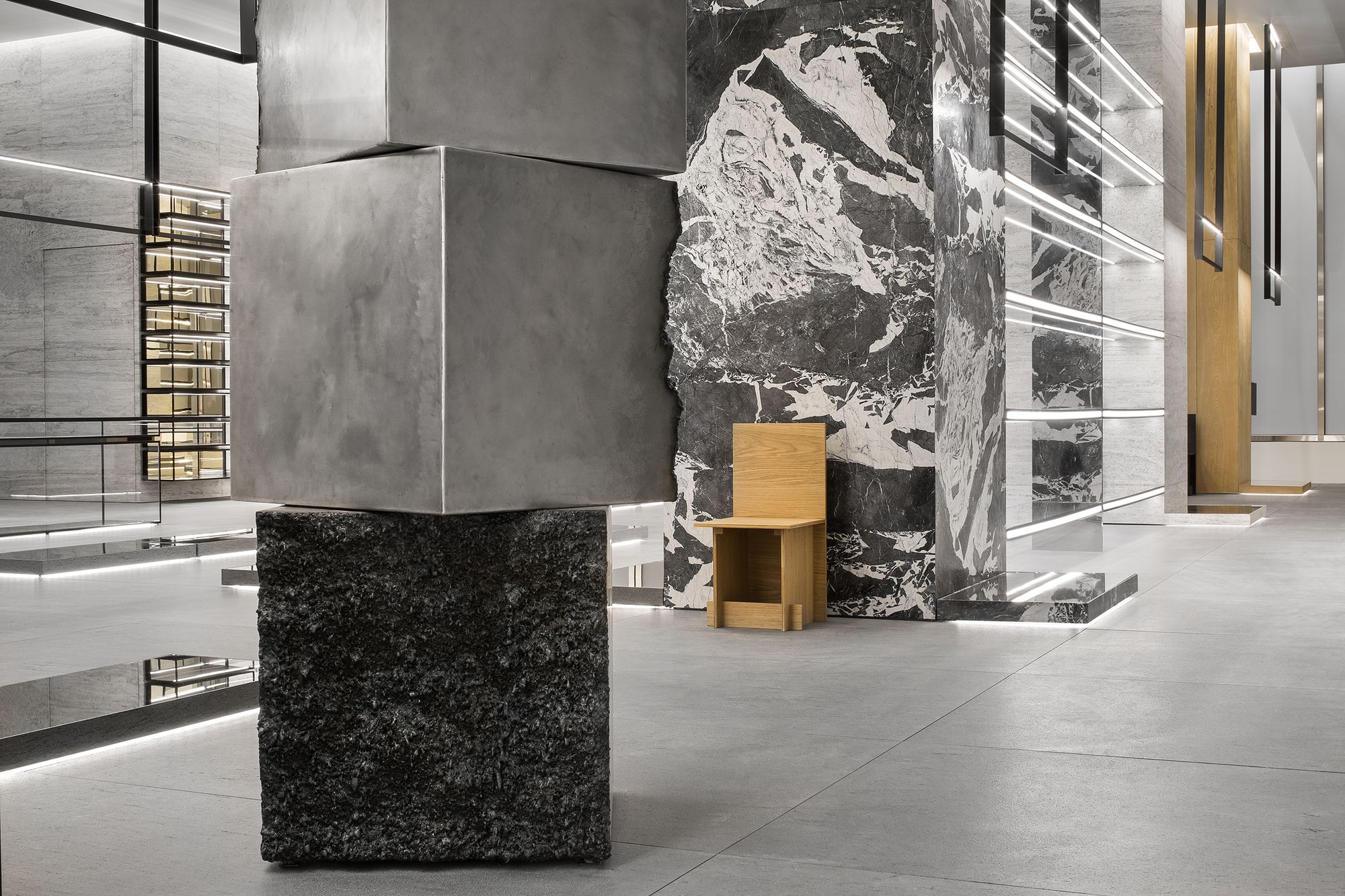
Surface report (stack) / Surface response (stack) (2019), a steel sculpture by James Balmforth, on display at the Celine store on Madison Avenue, New York City.
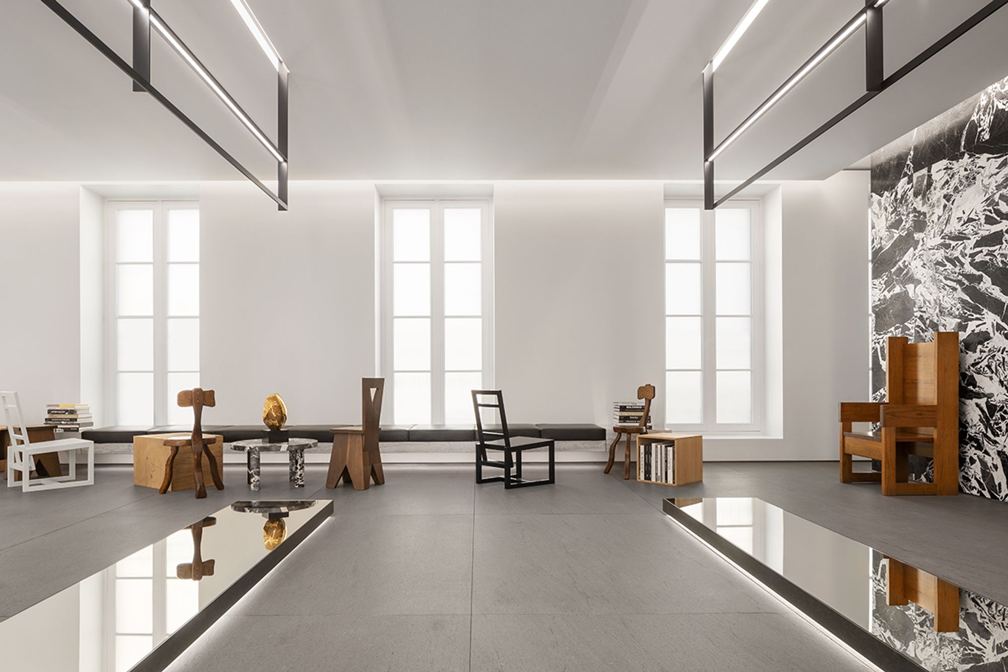
The Celine store on Rue Saint-Honoré in Paris.
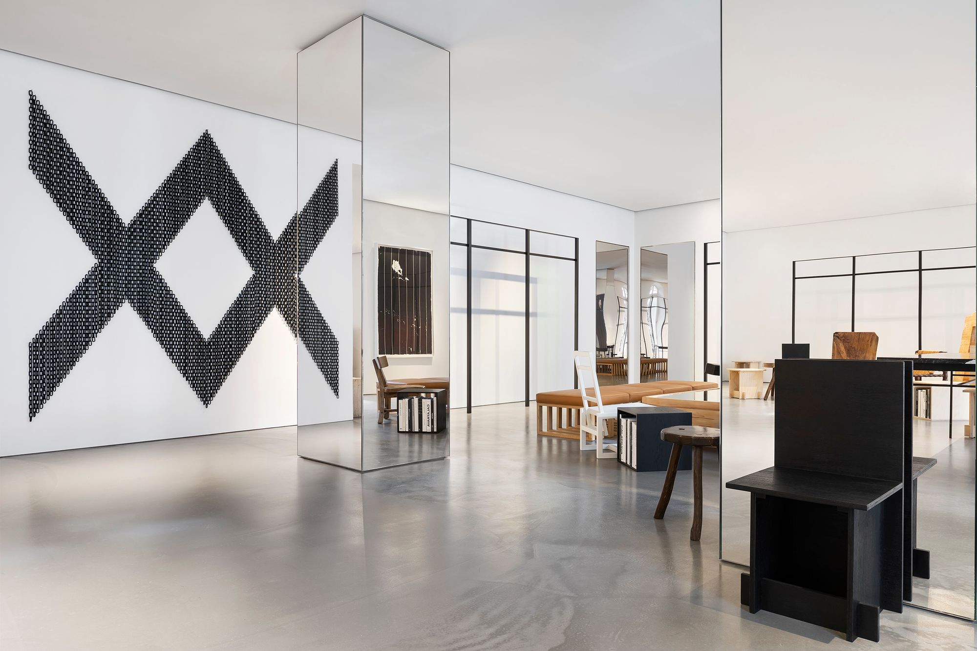
We don’t win anymore (2016), a powdered chain wall installation by Davina Semo, on display at the Celine store in Paris.

Tree (2018), a wooden sculpture by Charles Harlan, on display at the Celine store in Soho, New York City.

One of Banks Violette’s specially commissioned chandelier installations (2023), on display at the Celine store on Madison Avenue, New York City.