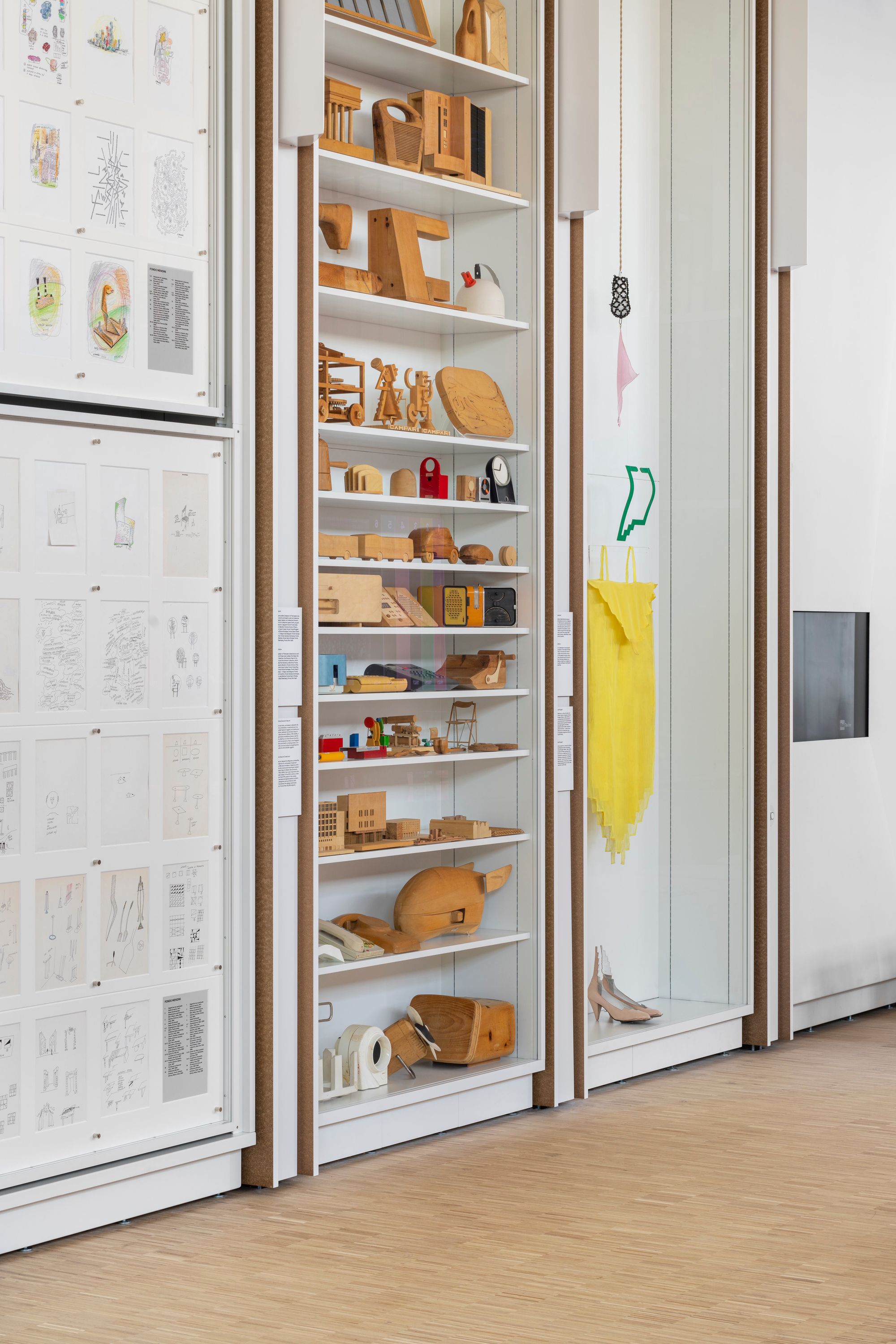
Research Study and Archives Center. Photo by Delfino Sisto Legnani-DSL Studio.
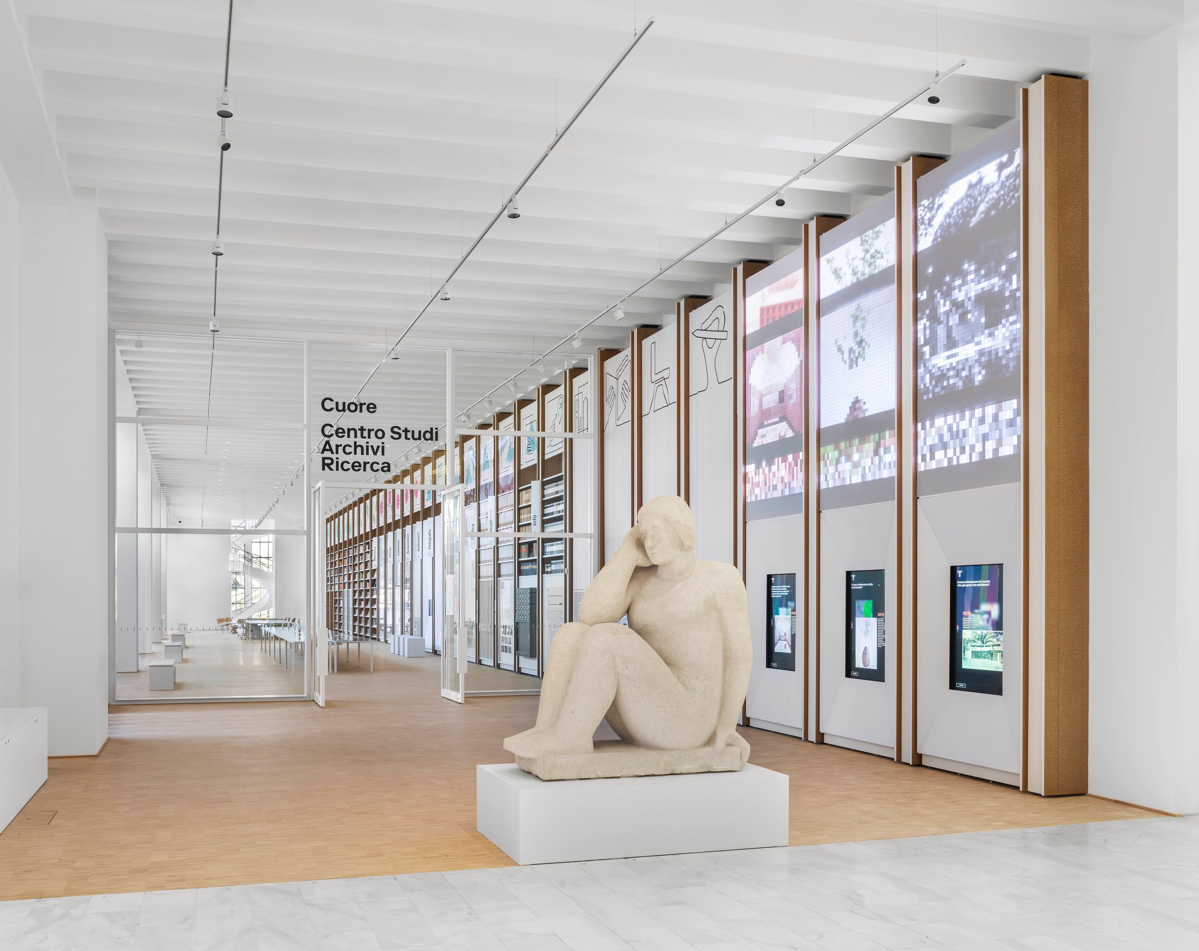
Research Study and Archives Center. Photo by Delfino Sisto Legnani-DSL Studio.
Located in the leafy calm of the Parco Sempione, the imposing, brick-clad Palazzo dell’Arte has been at the heart of Milan’s design scene since it first opened in 1933. Financed by the Lombard textile magnate Antonio Bernocchi, it was intended as a center for the promotion and development of Italian art and design, and also as a permanent home for the Milan Triennale, a design fair that began life as a biennial in Monza, in 1923.
It fell to the palazzo’s architect, Giovanni Muzio (of Ca’ Brutta fame), to design a functional, flexible building that could accommodate a whole host of temporary exhibitions and events. Rising to the challenge with characteristic panache, Muzio piled up two levels of mostly top-lit galleries in a clear, compact, axially planned parti that looked both forward and back: technically advanced in terms of construction — Muzio was among the first in Italy to use cement blocks, alongside reinforced concrete and vetrocemento, or glass brick — the palazzo is thoroughly Classicizing in both plan and elevation, with its triumphal-arch entrance, its semi-rotunda lit by round-headed windows, and its garden-elevation arcade.
Due, perhaps, to the palazzo’s strong links to the fascist regime, the postwar era felt little obligation to show the building much respect: as well as cementing over its glass block and chopping up its galleries into a disorienting circuit, Muzio’s successors mutilated his impressive interior courtyard, known as the “impluvium,” by dividing it vertically in half with a new floor. Now, as the palazzo approaches its centenary, an ambitious refurbishment program aims to revitalize it for 21st-century needs, while at the same time adopting a more sensitive approach toward Muzio’s architecture. Initiated by Triennale Milano’s president, Stefano Boeri, and launched in 2020, the renovation has been entrusted to Milanese firm Luca Cipelletti AR.CH.IT, which recently completed the latest phase of the project, a research and archive space baptized Cuore (“heart”).

Research Study and Archives Center. Photo by Delfino Sisto Legnani-DSL Studio.
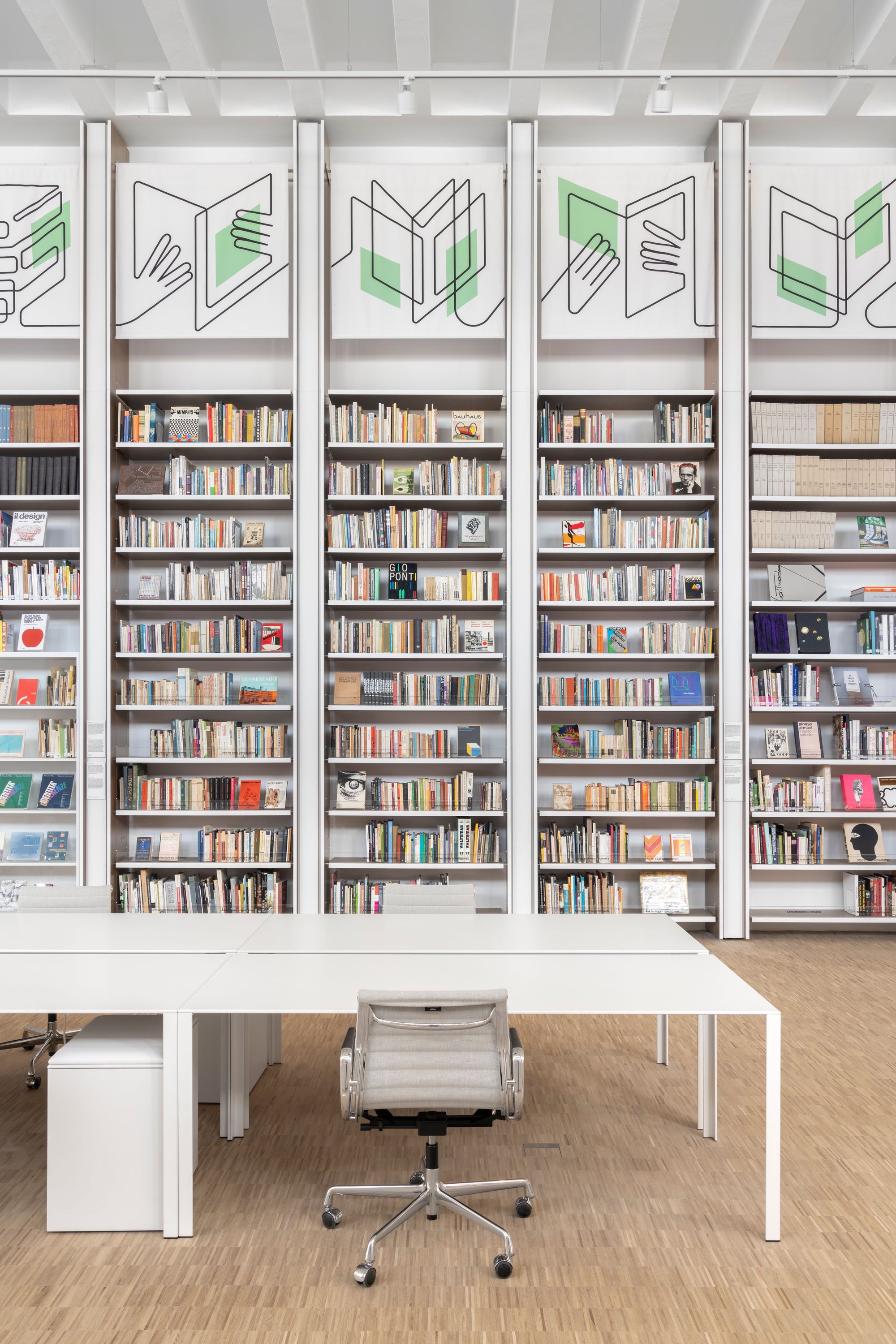
Research Study and Archives Center. Photo by Delfino Sisto Legnani-DSL Studio.

Research Study and Archives Center. Photo by Delfino Sisto Legnani-DSL Studio.
With this new intervention, located on the palazzo’s ground floor just after the main entrance, those who thought they knew the building are in for a surprise. “No one has seen this perspective in decades,” exults Cipelletti, who demolished all the postwar walls that divided up the 4,300-square-foot space so as to bring back its original proportions. With the return of Muzio’s monumental vision, the obscure and labyrinthine have made way for the clear and luminous, and the theatrical mise-en-scène of his bravura concrete stair, framed in an opening at the far end, thrills once more: spiraling freely upward inside an evanescent glass tower, it is a magnificent demonstration of Modernist technical knowhow.
The apparent simplicity of Cipelletti’s gesture belies the difficulties in restoring the gallery to its initial purity, an exercise that recalls the immortal line from Giuseppe di Lampedusa’s novel The Leopard: “Everything must change if we want everything to stay the same.” Preoccupied by the hygienist imperative for daylight and fresh air, early-20th-century architects like Muzio were bound by none of today’s energy regulations, let alone our stringent museum conservation protocols; installing all the necessary systems without defacing Muzio’s initial vision was thus a major undertaking, one that Cipelletti pulled off with brio.
Take, for example, Cuore’s heating. The inefficient 1930s radiators can still be seen halfway up the external wall, but they are no longer plumbed in, having been replaced by an underfloor heating and cooling system whose installation required raising up the industrial parquet. Yet the change in level is imperceptible, thanks to an extended slope in the gallery’s vestibule, between the palazzo’s main lobby and Cuore’s entrance partition. With its wafer-thin glazing bars and giant sheets of glass, the latter is another exercise in near-imperceptibility. As for Cuore’s high-performance, computer-controlled ventilation, which regulates humidity, and its state-of-the-art sound system, these have been dissimulated behind drywall panels underneath the gallery’s clearstory. And while those clearstory windows may look just like the originals, they are in fact modern replicas that incorporate double glazing and UV protection. Cipelletti also recreated the vetrocemento just under the clearstory — another improved reproduction — to bring back the abundant daylight that Muzio initially prescribed.
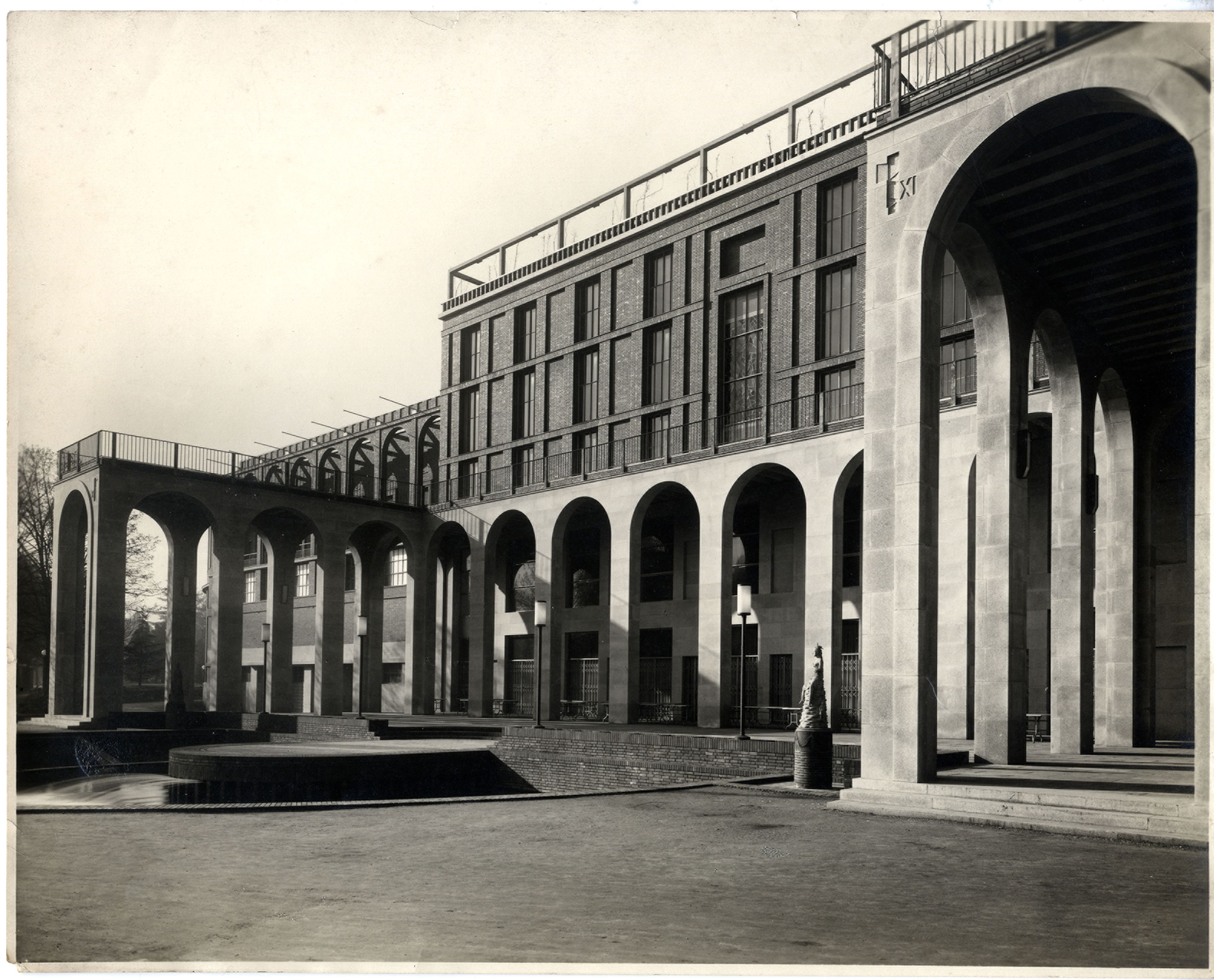
Historical image of the Triennale showing the façade along the park. Image by Fiori L. and Belski M.P./Abitare Segesta, courtesy Triennale Milano.
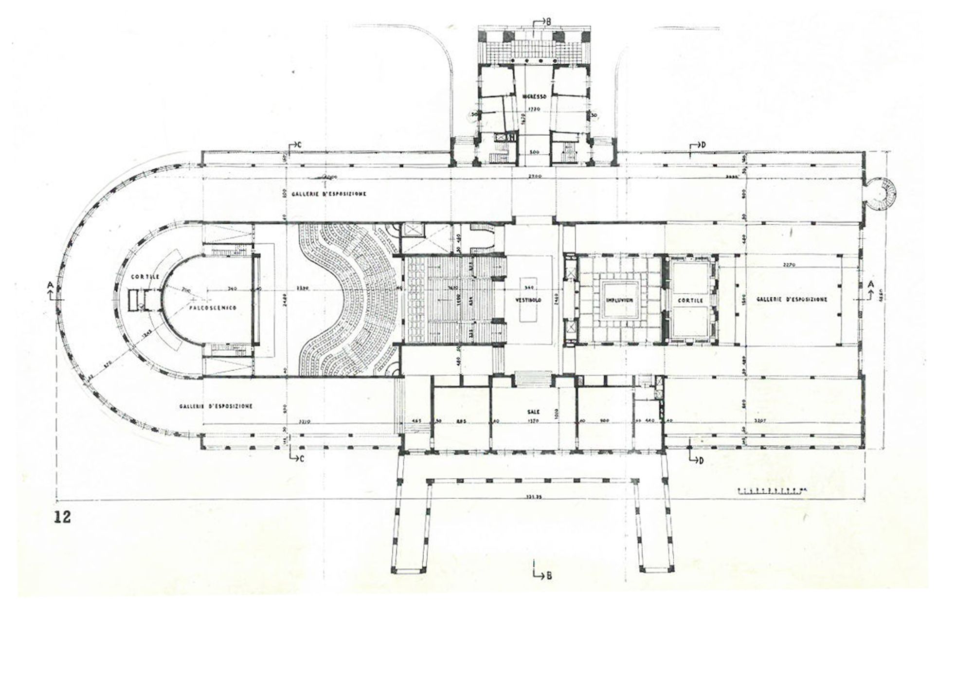
Floor plan of the Triennale building by Giovanni Muzio, c. 1930s © Triennale Milano Archive.
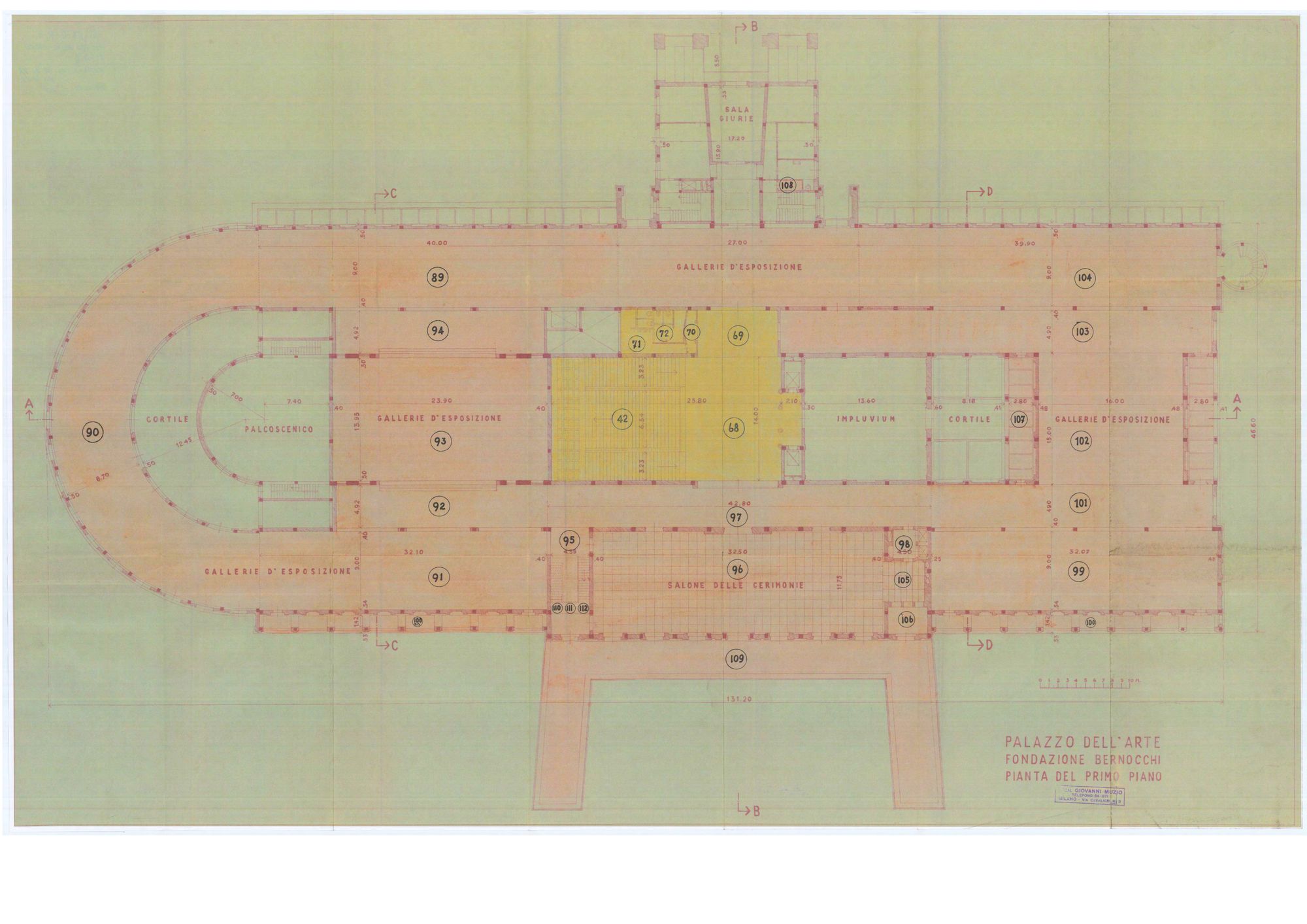
Floor plan of the Triennale building by Giovanni Muzio, c. 1930s © Triennale Milano Archive.
And as a consultation space and showcase for the Triennale’s extraordinarily rich archive (whose contents are stored in the basement below), Cuore required furniture and vitrines as well as museum-standard lighting. Realized in partnership with ERCO, the German architectural-lighting specialists, the countless individually controlled spots are complemented by “lantern-effect” nighttime lighting that allows Cuore to glow from within when seen from outside, as well as what Cipelletti calls the “brazier,” an uplighter placed under Muzio’s spiral stair to bring out its sculptural qualities.
Supplied and built by Italian office specialists UniFor, the discreetly sophisticated furnishings range from display cases specially adapted from Jean Nouvel’s Less Less tables to bespoke wall units that run the entire length of the gallery. Designed by Cipelletti down to the tiniest detail, and realized in recycled-timber board supplied by Saviola, the units are cadenced on the building’s concrete ceiling beams. To overcome the fact that the beams are not of equal widths, Cipelletti imagined a system with built-in give, its structural uprights being separated by panels whose dimensions can vary as needed.
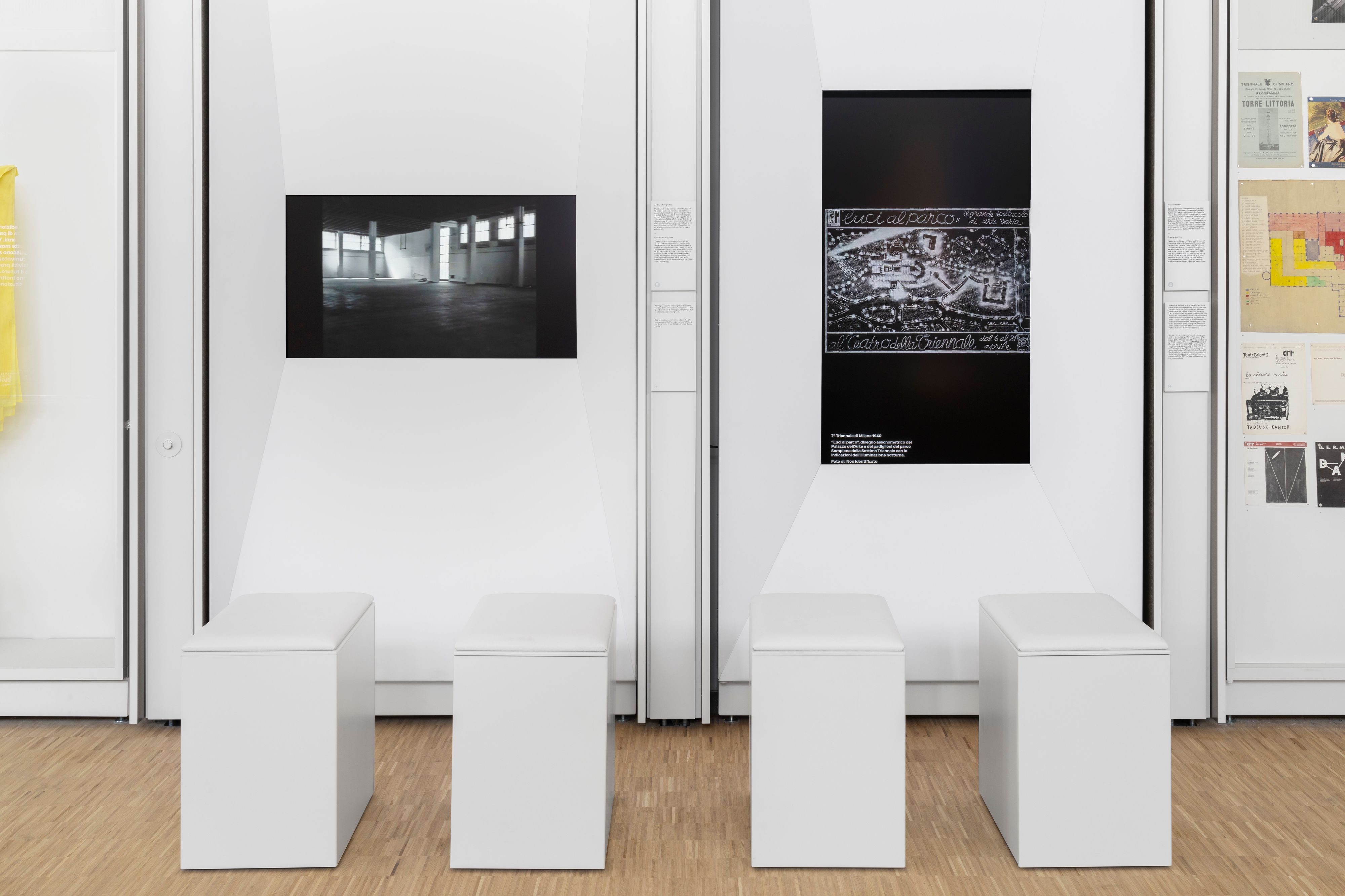
Research Study and Archives Center. Photo by Delfino Sisto Legnani-DSL Studio.
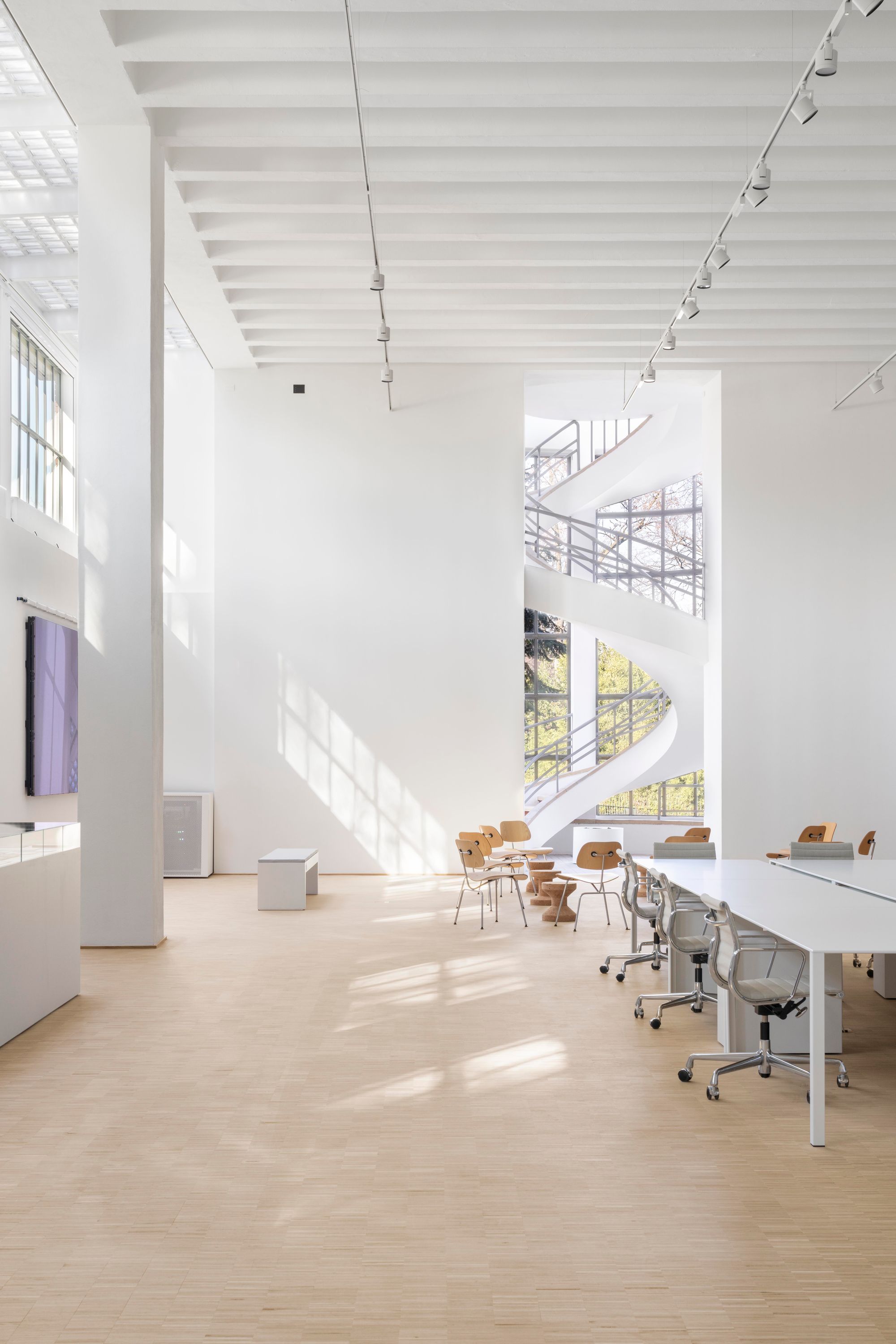
Research Study and Archives Center. Photo by Delfino Sisto Legnani-DSL Studio.
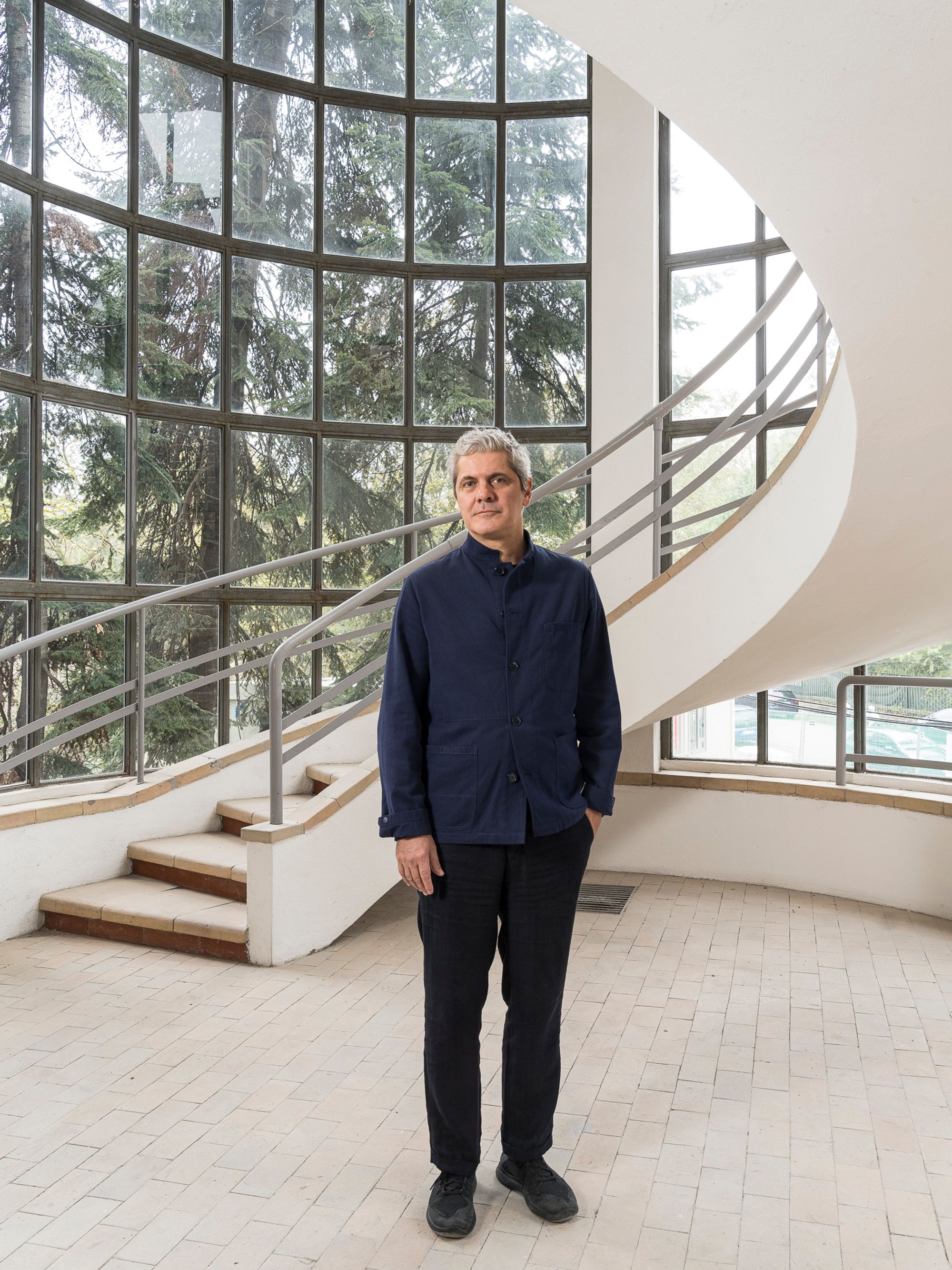
Luca Cipelletti. Portrait by Delfino Sisto Legnani DSL Studio.
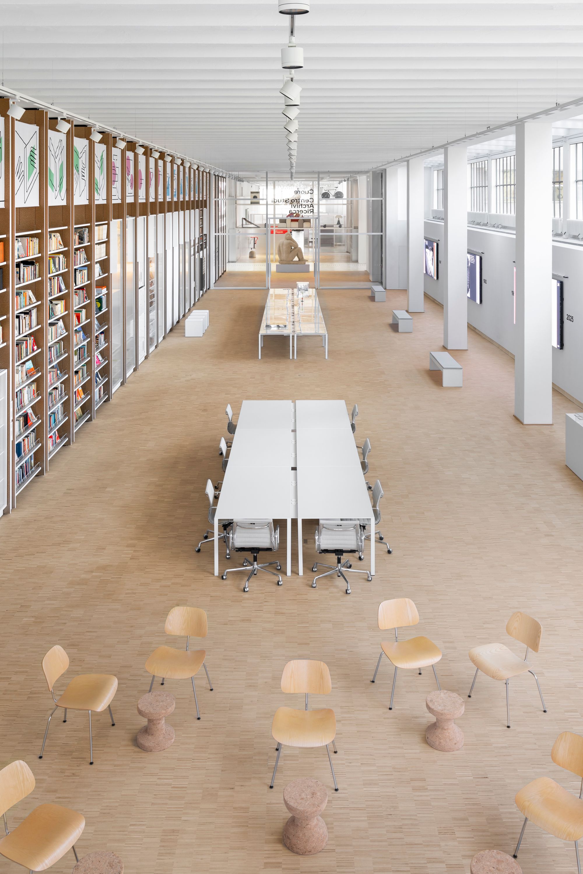
Research Study and Archives Center. Photo by Delfino Sisto Legnani-DSL Studio.
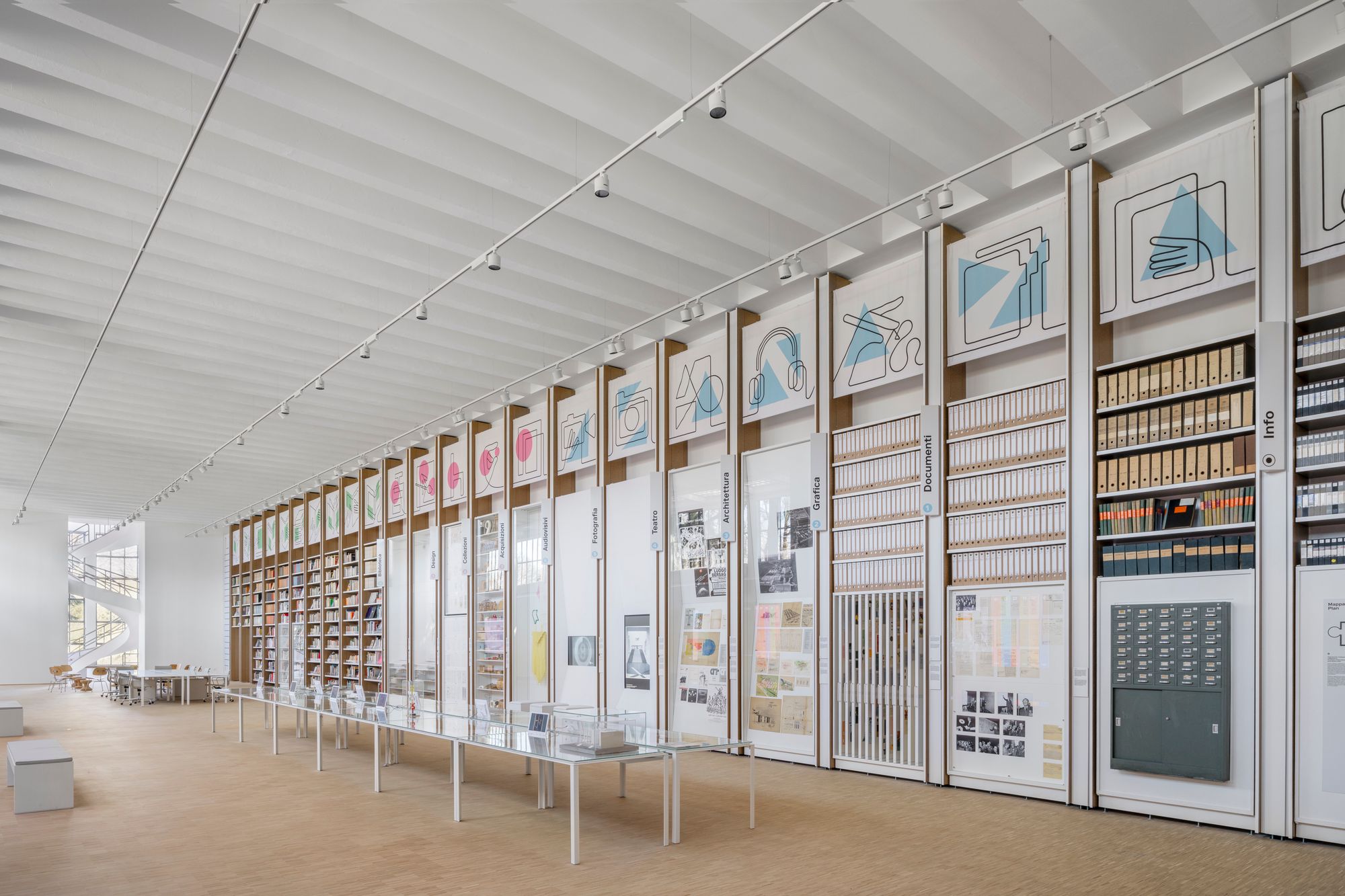
Research Study and Archives Center. Photo by Delfino Sisto Legnani-DSL Studio.

Research Study and Archives Center. Photo by Delfino Sisto Legnani-DSL Studio.
Another challenge was the enormous range and disparity of display objects — books, periodicals, catalogues, posters, drawings, blueprints, photographs, prototypes, etc. — with material from both the Triennale’s collections and the personal archives of design luminaries such as Antonio Citterio, Alessandro Mendini, and Ettore Sottsass. For the rotating exhibits, which must be shown in museum conditions (drawings must never touch the glass, dust must be kept at bay), Cipelletti and UniFor developed ingenious and complex combinations of drawers, shelves, and pivoting panels.
Rigorously integrated with Muzio’s architecture, the storage units allow the Triennale’s story and archives to be better understood by visitors — free of charge to enter, Cuore puts this precious material at the heart of the institution’s identity. Like Muzio’s building and Cipelletti’s refurbishment, Cuore looks both forward and back, an idea signaled by the monumental female nude greeting visitors in the vestibule. Designed by the artist Mario Sironi in 1933, the limestone statue once adorned Muzio’s impluvium; today, with her contemplative posture and pensive gaze, she guards the entrance to Cuore like some benign goddess of research and remembrance.
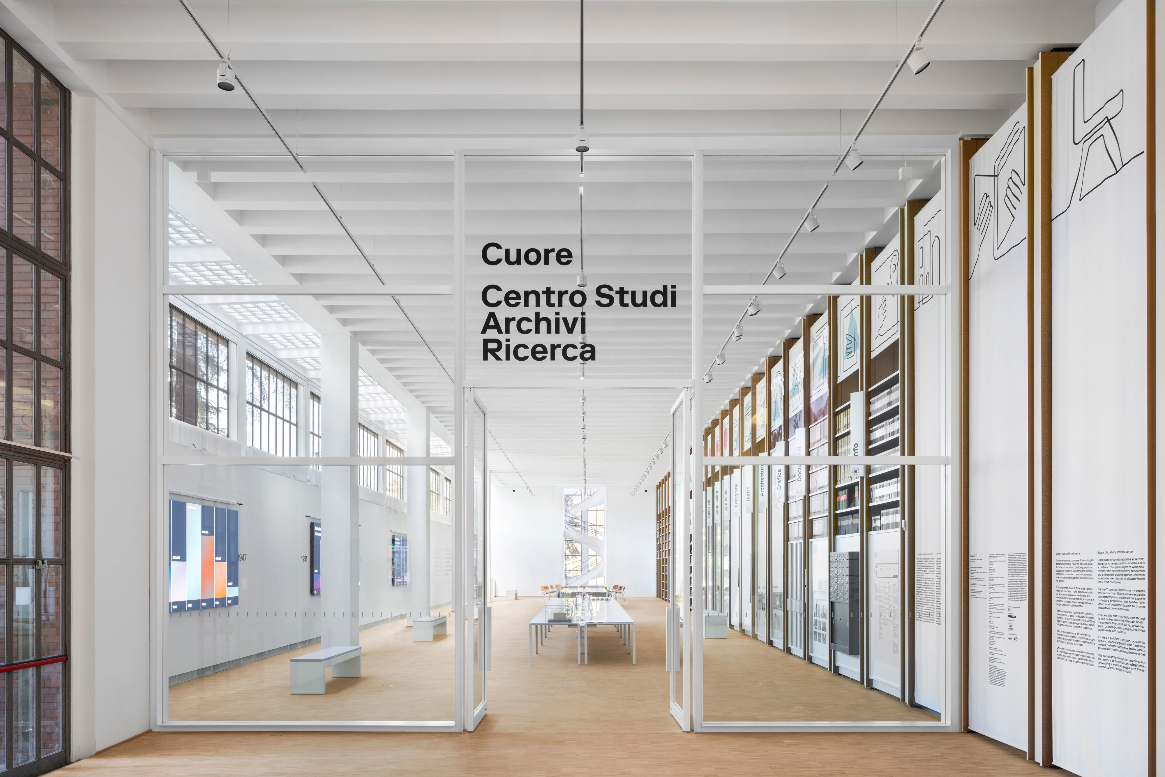
Research Study and Archives Center. Photo by Delfino Sisto Legnani-DSL Studio.